How to buy a new credit union website
Before you begin a credit union website project or start writing an RFP (Request For Proposals), there are three main questions to think over: “why”, “how”, and “who”?
Why?
Make sure you’re clear on your strategic and long-term reasons for updating your credit union’s website. Technology moves fast, and the world changes even faster. Focus on the future and the “big picture”.
Don’t get sidetracked by a laundry lists of features. Concentrate on principles, choices, and structures that will help you leverage your website to drive growth, fuel member engagement, respond quickly to change, and maintain the most flexibility and adaptability.
How?
What technologies will best support your strategy now and years into the future? An easy-to-use, well-supported, flexible, extensible CMS (content management system) is vital.
Who?
This question may be the most important, but it’s also the most-ignored. Who’s got your back? Do they understand credit unions, credit union brands, and CU growth? Are you compatible? How are they going to help you ensure your website continues to lead the way for many years to come?
Why Update a Credit Union Website?
Credit Unions must have websites that can keep up, and continue to evolve and lead the way for the foreseeable (and unforeseeable) future.
Your website is the branch that never closes.
- More members and potential members will see and use your website than will ever see or use any branch.
- Compared to bricks and mortar, a website is a screaming purple zonker slam-dunk bargain.
Your website is (or should be) the best of your brand in action.
- Even if your old site is “not bad”, an outdated, inflexible website costs members and growth and hurts your brand.
- Potential new members are using your website to do due diligence. They’re not just looking for raw information; they want to know what you’re like. And “out of date and out of touch” is not a good look.
Your website is both the cornerstone and the foundation of growth.
- A great website levels the playing field in a profound way. It erases weaknesses and amplifies strengths for credit unions of all sizes and missions.
- Without a great website you can update quickly and easily, your marketing, digital marketing, and data-driven marketing efforts will faceplant at the finish line.
How to build the website your members deserve
You must have the tools to support and drive growth, both now and in the near future.
Today’s CU websites need these capabilities NOW:
- Seamless, flexible third party integration: Home banking, bill-pay, search, Google maps, CRM, enhanced analytics, secure forms, calculators, locators, chat and more
- Mobile-first, touch-friendly design (mobile usage is well past 50% at most CUs)
- Simpler, faster, easier-to-understand, easier-to-update interfaces
- Accessibility/ADA Conformance baked in from the start
- Optimized for natural language and voice search
- Built for speed (loading speed is important to mobile, so it’s important to Google)
- Built for continuous change and evolution; faster updating and adding new capabilities
- Built to enable and encourage experimentation, testing, and iteration
- Built to take a strong brand and move it forward
CU websites will need these capabilities now or in the near future:
- Automation and personalization; content automatically tailored to user needs using many kinds of data.
- Tighter integration and coordination with data-driven/automated marketing, content marketing, and physical/electronic media.
- Analytics, enhanced analytics, and testing
- Greater reliance on internal search and voice search vs. navigation
Choosing the right CMS and technology for a credit union website
I’ll make this part easy: the CMS (content management system) wars are over and WordPress won. WordPress powers over a third of all of the websites around the world, for several reasons:
Two words: continuous evolution
- This is your last platform change; start evolving continuously rather than starting over every three to five years.
- Increase the slope of your evolution and improvement curve.
- Decrease the slope of your learning curve
- Greater agility when you can iterate and evolve far faster.
- Move from playing catch-up to anticipating and leading member needs and new technology
WordPress powers millions of the world’s most powerful websites
- No proprietary software, no vendor lock-in.
- WordPress is a thriving ecosystem with thousands of WordPress developers.
- Nearly unlimited capabilities can be added through thousands of WordPress plugins.
- Properly managed and hosted, WordPress is secure and reliable.
Tools for increased productivity
- We use a drag-and-drop WYSIWYG Page Builder on top of WordPress to make life easier for our clients. (It’s the largest WordPress Page Builder system, powering over a million websites.)
- Routine updates to content, images, rates, promotions, videos, and more should be easy and lightning-quick.
- Complex updates, such as new product pages, landing pages, navigation changes, video galleries, graphs, and more should also be drag and drop simple.
- Third Party integration is seamless. Home banking, bill-pay, search, Google maps, CRM, enhanced analytics, secure forms, calculators, locators, chat and more can all be integrated into your new site.
Who should I pick to design, build, and host my CU site?
Compatibility is vital when you’re choosing a website vendor. The right website partners will make your life easier and make you far more efficient and effective.
You’ll be spending a lot of time together, so it’s important for your CU and your developers to have compatible cultures and a high level of mutual trust.
And of course, expertise is vital as well. Developers with deep expertise and experience with credit unions and credit union websites can multiply your effectiveness and save enormous amounts of time and trouble with everything from content to compliance.
A few important credit union website vendor compatibility questions to consider are:
- How compatible are our cultures?
- Can we get to know the people we’ll be working with day to day?
- How well do they understand credit unions?
- How well do they understand OUR credit union?
- Do they understand credit union branding?
- Do they understand how to coordinate our website with our entire tech and marketing mix?
- Do they understand compliance?
- What can we expect when we need tech support?
- What can we expect when we need changes?
- What can we expect when we need creativity, something different or custom?
- What kind of support and expertise can we tap into when we’re facing a major challenge or change?
Starting a credit union website project soon?

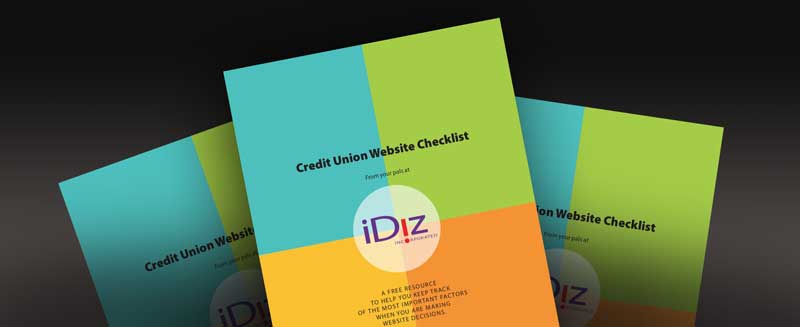
We’re here to help you make your CU website a success! Download our free CU Website Checklist to help you keep track of the most important factors when you’re making website decisions. Check it out!
- Five ways you’re scaring members away - October 29, 2024
- Five ways to make car loans interesting - October 8, 2024
- “Meatspace” is a CU superpower - October 1, 2024
