Credit Union Website Best Practices #2: Simplicity
Welcome to a new series from iDiz, Inc., “Credit Union Website Best Practices” where we’ll share up to the minute details of what we’ve learned and what we’re still learning about building credit union websites.
Credit union websites are about utility, not entertainment – people visit your site to solve a problem, get information, or to get something done. And everything you can do to remove barriers and speed up that process makes your site better and more effective. Think slippery, not sticky.
What makes a credit union website simple?
First, a few parameters. What are the features that make a site simpler and better?

- Members and non-members can find the most-needed info with minimal interaction, often within one tap.
- Ideally, all info on the site is available with one or two interactions
- Language is direct, everyday, and to the point, with minimal “fluff”, simple vocabulary, no jargon, simple sentence structure and few idioms.
- Images are chosen to enhance, but never get in the way of understanding for folks who can’t see the images.
- Minimal visual “clutter”
- Careful attention to the mobile experience so that nothing is lacking on mobile devices
- Elegance and minimalism in design
- A clear brand that doesn’t get in the way of understanding
- Consistency in typography, layout, and interface
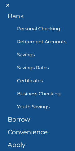
- Straightforward navigation focused on usability over “bling”
- Internal search that works – as mentioned in the last article, some folks use search as a replacement for navigation.
Why are simpler credit union websites better?
Lots of reasons. Here are a few:
- It’s easier and faster for members to understand and find what they need on a simple site
- More members can self-service if they can find the answers they need quickly
- Simpler navigation is easier and faster for everyone, and more accessible
- Simple language is far more accessible to people who don’t read at a high level, or people who have a different first language.
- Simple language is easier and faster for everyone to understand, even those who do read at a high level.
- Simple sites are faster and work better on mobile devices.
- Simpler sites are much easier for search engines to understand, and sites that work better on mobile devices also get a boost in search rankings.
- Simple sites are far easier to maintain. Accurate info is vital, and with fewer pages to manage, you’ll be able to keep up with updates far better, and to pay more attention to fine-tuning pages and content, and removing stale content.
- Better Accessibility. For example, simpler navigation is much easier to use for folks with difficulty using a mouse pointer, or who can’t absorb a long list of options in a few seconds.
- Less complexity also pays off when it’s time to add to or update your site in the future
- A clear, simple, easy-to-understand website enhances your credit union’s brand; it looks more confident and feels more approachable and modern. Clutter is soooo 2010…
Product page pruning pays
In the last few years, the average number of pages on credit union websites has dropped dramatically. Most websites for full-service credit unions nowadays end up around 50 – 70 pages (not counting things like blog posts and special-purpose landing pages). A few years ago, 125 – 150 pages was more typical.

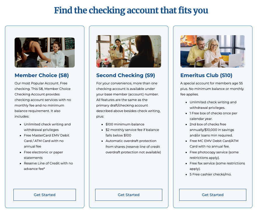
Consolidation is a big part of this. Instead of a page for each checking account, it’s usually better to put them all on the same page in a layout that makes the differences and similarities clear. Or better yet, consolidate your products down to one checking account that has everything for everyone. Why make members choose in the first place?
And there are also things you just don’t need to explain in detail any more. For example, mention your debit card on your checking page, but there’s no need to give it a page of its own.
You can do the same with credit cards or unsecured loans. Put all the options for your cards on one page so they’re easy to compare. Put all your variations of personal loans on one page to communicate that you’re the answer to whatever they’re dreaming about, whether that’s a fancy new mower or a fancy wedding.
Pages to add
On the other hand, there are a few times you really should consider adding pages or blog posts.
For example, a lot of PDFs are content that would be a lot faster, simpler, and easier to understand as a web page. Unless you really need a document to have a very specific layout for printing, make it a page and not a PDF.
And some topics deserve their own pages or blog posts. For example, do you have a page or two of information for Spanish-speaking people? Do you have clear instructions on your site for resetting your online banking password? Do you have an FAQ page that actually has answers to real Frequently Asked Questions? Do you have info on your site to help members going through common life events like divorce, bankruptcy, eviction, or illness? Maybe a page explaining the car loan application process in detail would help members understand what they’ll need before they go car shopping.
Simple ain’t easy
Building a simple and easy to use credit union website is surprisingly complex. It takes experience and a lot of specialized knowledge to build a robust, easy to use, accessible interface for a credit union website, so get professional help and an outside perspective. The technical details matter a lot to future usability, maintainability, and flexibility.
It’s also very difficult to keep a simple website from turning complex. You need a strong understanding of your credit union’s brand and priorities, a good handle on the member experience, and the willingness and authority to keep everyone’s pet project from turning the home page into a yard sale. Keep a consistent brand voice and focus the website on the member experience, not selling the flavor of the moment.
Got an idea for a CU website topic you’d like us to cover? Need a hand building a great credit union website that works for you and your members? Get in touch!
- Start Credit Unions to Save Credit Unions - November 7, 2024
- Five ways you’re scaring members away - October 29, 2024
- Five ways to make car loans interesting - October 8, 2024
